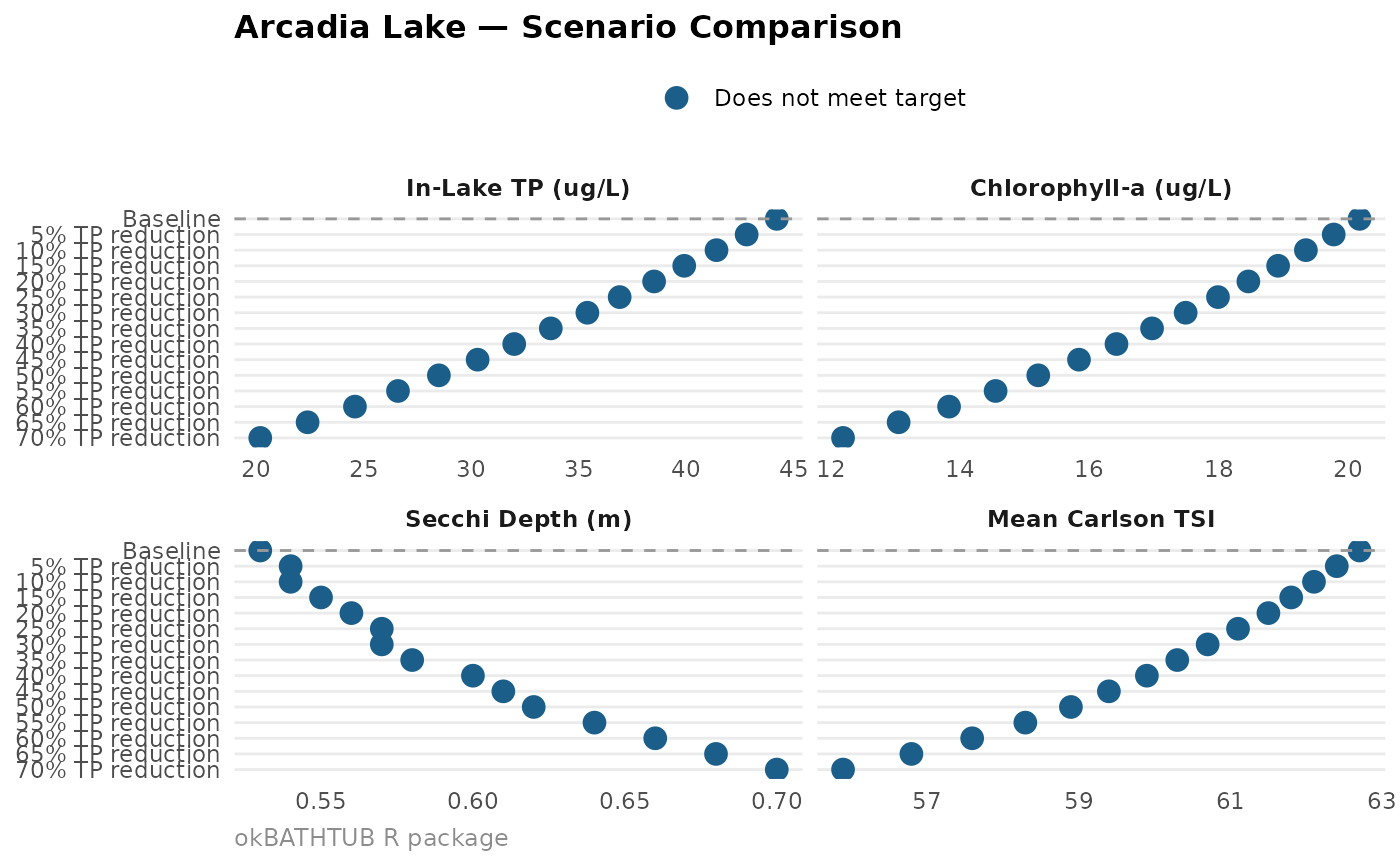
ok_plot_scenario() visualises the output of ok_scenario() or
ok_scenario_sweep() as a faceted dot-and-line chart, showing how
key water quality metrics change across loading scenarios.
Usage
ok_plot_scenario(
  scenario_result,
  metrics = c("tp_inlake_ugl", "chla_ugl", "secchi_m", "tsi_mean"),
  highlight_target = TRUE,
  lake_name = NULL
)
Arguments
- scenario_result
A data frame returned by
ok_scenario()orok_scenario_sweep().- metrics
Character vector. Which metrics to plot. Any subset of
c("tp_inlake_ugl", "chla_ugl", "secchi_m", "tsi_mean"). Default: all four.- highlight_target
Logical. If the scenario result contains a
meets_targetcolumn, highlight scenarios that meet the target in green. DefaultTRUE.- lake_name
Character. Lake name for the plot title.
Examples
# \donttest{
baseline <- ok_load(inflow_m3yr = 45e6, tp_inflow_ugl = 120,
coefficients = "oklahoma",
ecoregion = "Cross Timbers") |>
ok_hydraulics(surface_area_ha = 890, mean_depth_m = 4.2)
sweep <- ok_scenario_sweep(baseline, target_class = "mesotrophic")
ok_plot_scenario(sweep, lake_name = "Arcadia Lake")
 # }
# }